I registered the hyperglitch.com domain back in 2010 (January 21st, according to whois lookup). Initially, I just wanted a site to put some of my projects on and a cool domain for my email address. Few years later, when I wanted to start my company, I decided to use the same name, since I already had a domain and email (maybe not my best idea but it is what it is).
After getting the domain, first design was quite simple static HTML page. It was a single page with a few links. Unfortunately, I don't have the screenshot anymore and Wayback Machine doesn't have it.
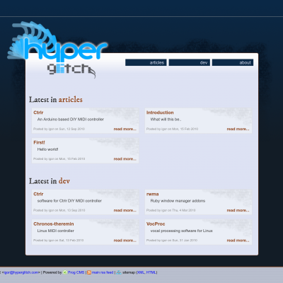
But few months later, Ivan Brkić, a friend from university, offered to make me a new design. At that point I also wanted some proper CMS so I went with FrogCMS, quite obscure and minimal CMS, and around the March of 2011 new design was up and running: Wayback Machine link
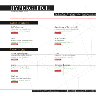
Two years later I wanted something new and decided to design it myself. Main characteristics were somewhat brutalism-inspired design and glitchy elements (all headings and links had a glitch effect on them). It went live in February of 2013. I really liked this design (although I'm quite biased) and kept it, with minimal changes, for ten years. Wayback Machine link
In the meantime HYPERGLITCH became a company and the website didn't really represent it properly (besides the minimal legally required company info). I wanted some nice landing page with info and a refreshed look while keeping some "signature" elements but didn't know what to actually do. Enter amazing Lucijana Dujić Rastić from Studio Utopia. Together with some of my own elements we came to this amazing new look that can be seen currently, which went live in September of 2023. I might be quite biased but I think it looks awesome. I also migrated from long obsolete FrogCMS to Grav CMS which seems to be really good (for now).

